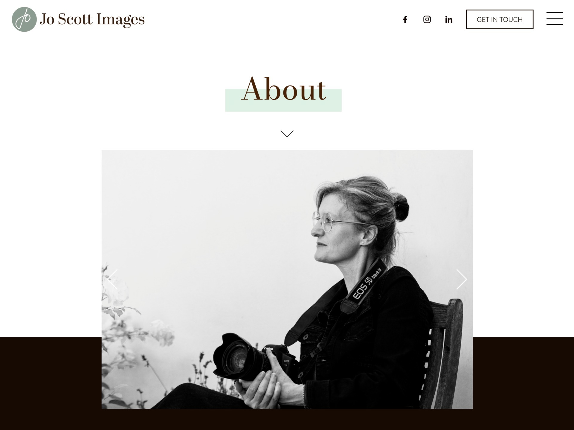
Jo Scott Images.
Professional photographer
"I love my website by it'seeze! Ann made the process really easy for me and worked hard to get a design to showcase my business just as I wanted it. She held my hand through the technical stuff, for which I am very grateful. I would highly recommend Ann and it'seeze."
Jo Scott
The Brief
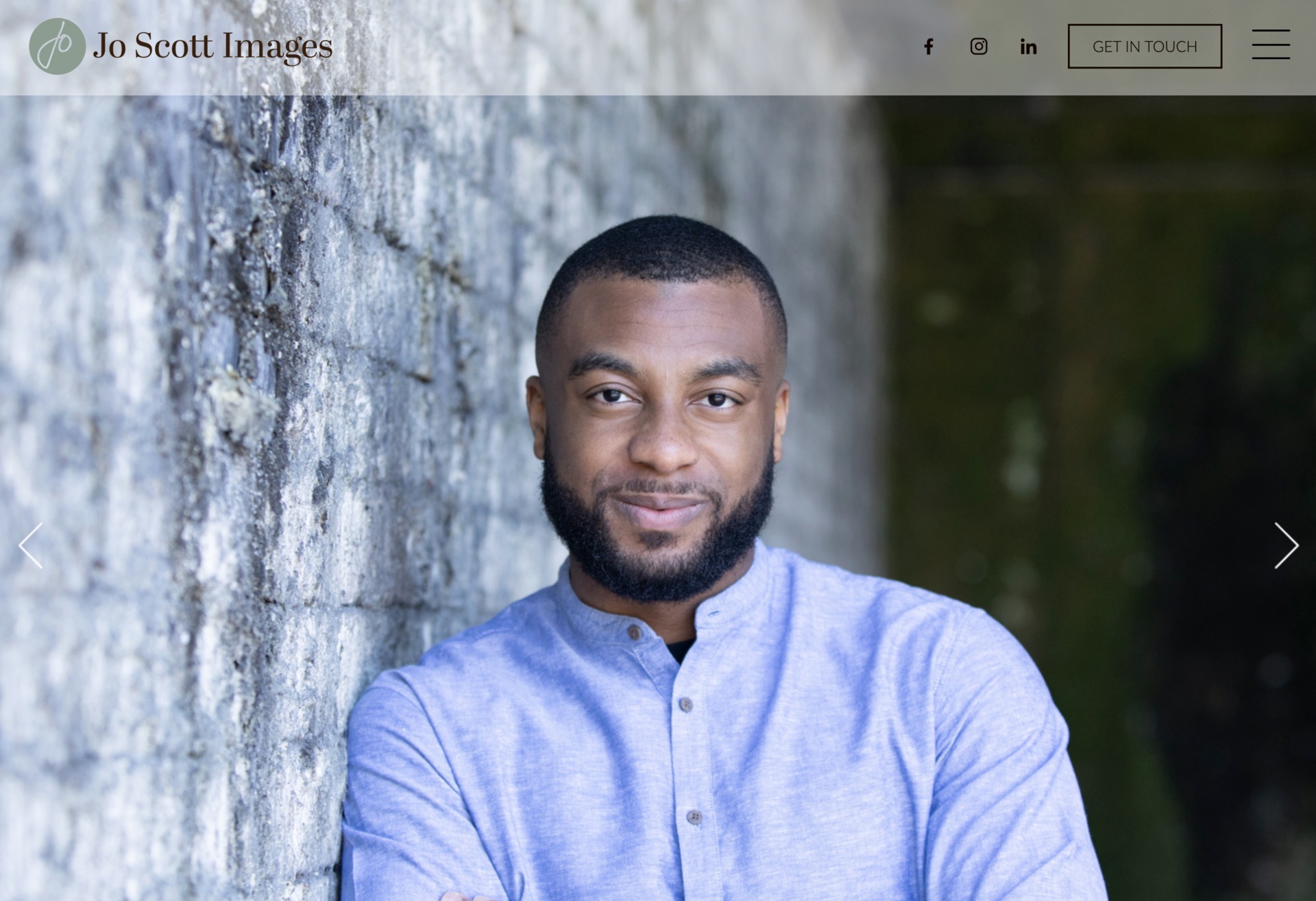
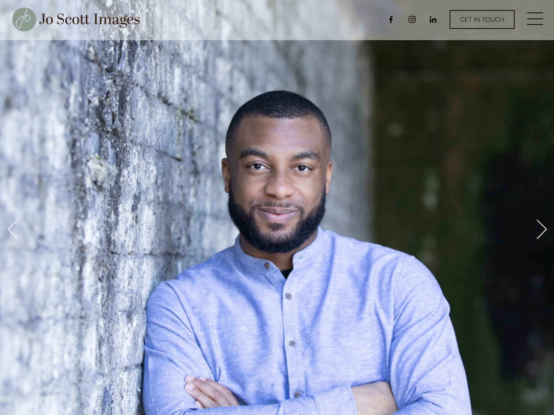
As a professional photographer who works with many corporate clients, providing photography for a variety of media, including websites, social media, and brochures, Jo Scott understands that websites are key to any business.
As a long-time client of it’seeze Windsor, Jo felt it was time for a complete website redesign to ensure her site accurately reflected the evolution of her business and fully aligned with her brand.
The Solution
Jo met with it’seeze Windsor owner Ann Naylor to discuss how the new Jo Scott Images website should look and feel. They discussed the importance of a modern, professional design that would showcase Jo’s photography and highlight her services.
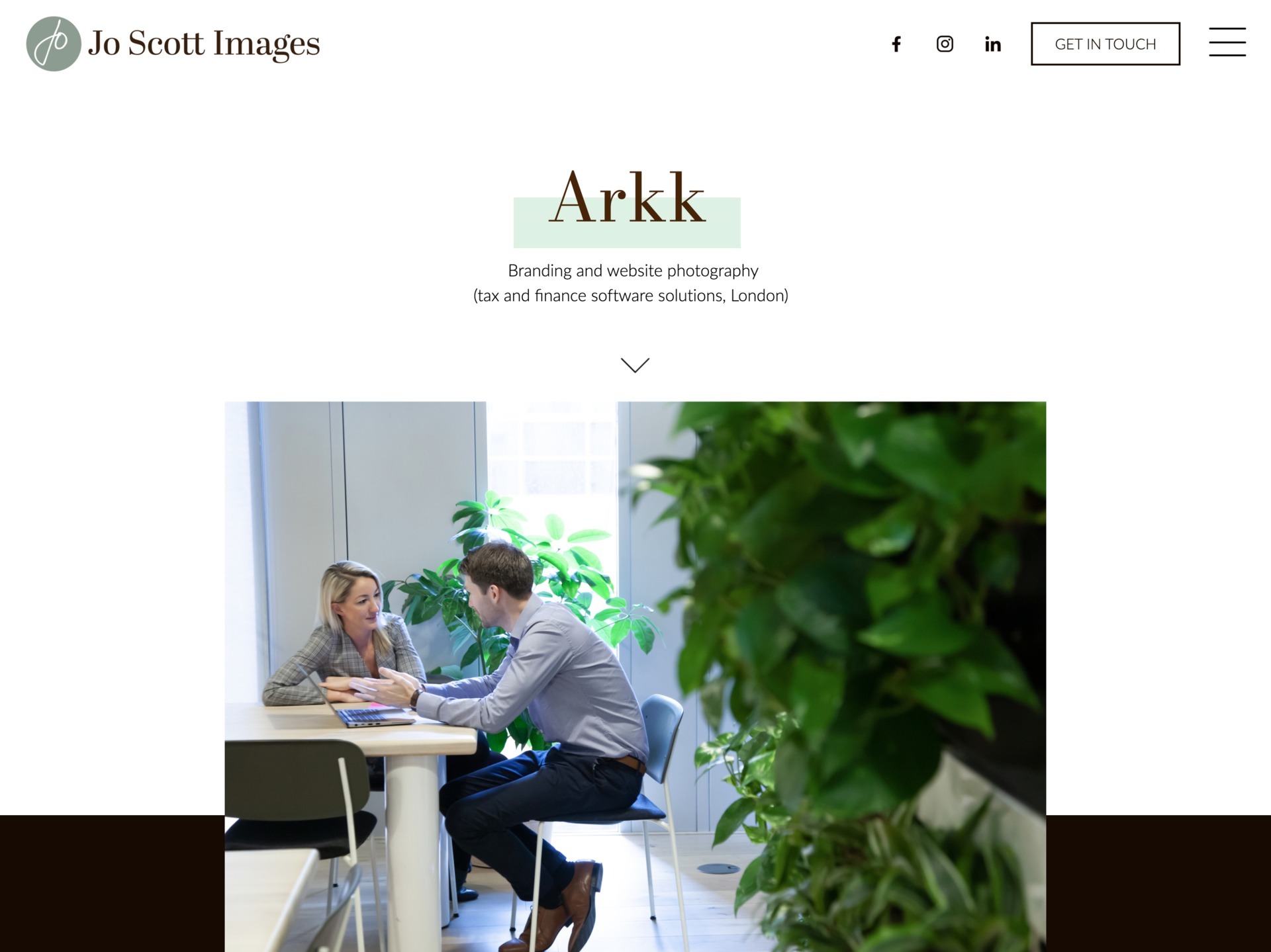
The it’seeze team got to work creating a new design for Jo's website. The new design features full width fading images on the home page, which allows website visitors to immediately see examples of Jo's work when they visit the site. There is further animation throughout the site, which creates an interactive experience for visitors. The new website includes a case studies section that highlights Jo's work and demonstrates how her expertise has helped her clients.
The new site is fully responsive, which means that it will automatically adjust its layout to fit the screen of any device. So, it can be viewed and navigated easily on any device, from desktops to laptops, and tablets to smartphones. This ensures that visitors have a great experience regardless of where they are viewing the website.
The Outcome
Jo is delighted with her new website. She said ‘’Working with the fabulous Ann Naylor over donkeys’ years has been amazing and she has come up with the goods again! It's been a total redesign to represent where my business is right now, and to align with my brand.’’ She continued ‘’It's great to work with you Ann Naylor. You completely get me and my brand! What I love is the fact that I can amend and add to it myself!’’
Of course, all the photos on the site are Jo’s! You can take a look at the new website here.